Tesla
Tesla Model 3 hands-on: First impressions of the most important car of the decade
GearBrain takes a seat in Elon Musk's first budget electric car

GearBrain takes a seat in Elon Musk's first budget electric car
It's no overstatement to say the Tesla Model 3 is one of the most important cars ever made. To arguably be included in the same league as the Ford Model T, Volkswagen Beetle, Mini and Land Rover, the Model 3 is — Tesla hopes — proof that electric cars can be reasonably priced, and travel acceptable distances, between charges.
It is the finale of act one of Elon Musk's Tesla performance. The electric car concept is now proven with the original Roadster — then refined with a pair of luxury electric vehicles (EVs) in the form of the Model S and Model X. Finally, the profits from those has given birth to the 3, an electric car affordable for the masses.
A lot rides on the Model 3's shoulders, yet things have got off to a slow start. Revealed in April 2016, the car was delayed — as is common from Musk — and now Tesla is working all-nighters to wade its way through "production hell" in a bid to fulfill the car's half-million pre-orders. As the competition — the established, century-old competition — closes in, Tesla is running out of time to make the $35,000 to $55,000 EV segment its own, as it did with the luxury end of the market.
As rivals from Nissan, Honda, Jaguar, Volkswagen, Audi, BMW, Porsche and others begin to come online, the Model 3 must appeal to the mass market, not just to die-hard Tesla fans who will buy one regardless, just as Apple fans snap up the latest iPhone. The Model 3 has to be a valid option for consumers who will compare Tesla on a level playing field with the might of its European rivals, and there can be no excuses.
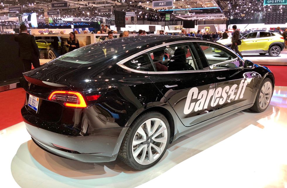
With all that in mind, GearBrain encountered its first Model 3 this week at the Geneva motor show. Despite not being available yet in Europe — the last we heard, dealerships in London were warning potential buyers of a two to three year wait — a Model 3 sat on the stand of Caresoft, an engineering solutions company which is reportedly selling information about the car to Tesla's rivals. With Tesla not at the show in an official capacity, this is the first chance for Europeans — this writer included — to experience the car first-hand.
Tesla Model 3 first impressions:
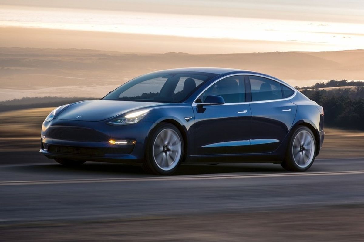
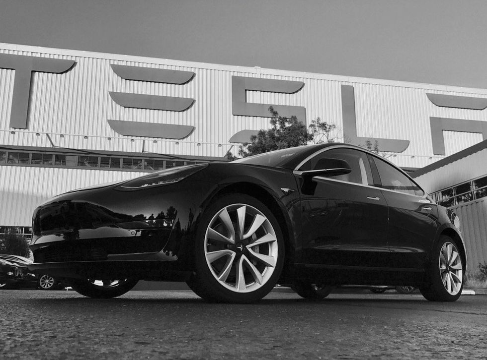
Firstly, black is not a great color for the Model 3. As with most cars, the color hides its lines and curves, making it look flat, simple and fairly uninteresting. Tesla's metallic red or dark blue (above) would have been a much better alternative. But with Caresoft buying Model 3s on the second-hand market to take them apart and sell their findings, we don't suppose color is a primary concern.
When driving isn't an option, the biggest draw on the Model 3 is its interior. Bold and vastly different to anything else on sale today, the dashboard takes minimalism to a whole new level.
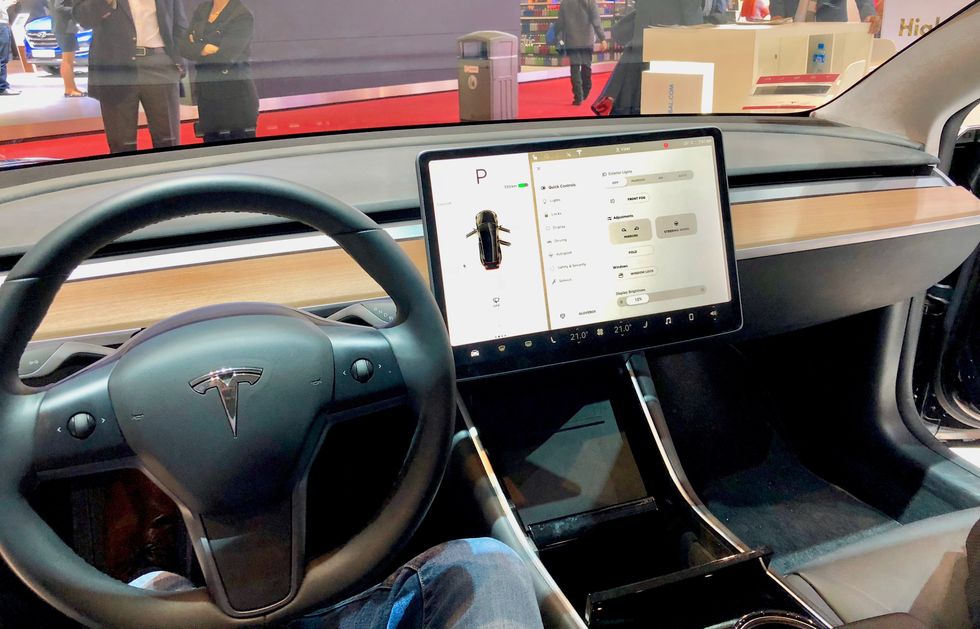
There are no instruments behind the steering wheel, where you would normally find a speedometer and other readouts. Instead, everything is displayed on a centrally-mounted 15-inch touchscreen, which is positioned horizontally instead of the vertical 17-inch screens of the Model S and Model X. As in those cars, controls for the heated windshields, heated seats and climate are all permanently displayed at the foot of the screen. When driving, your speed is permanently displayed in the top-left corner, putting it as close as possible to the driver's line-of-sight.
We imagine that this will all be switched for cars sold in right-hand-drive markets like the UK, Australia and New Zealand. Speaking of right-hand-drive markets, the dashboard's symmetry means the display can be in the same position on Model 3s sold the world over, while only the steering column and pedals need to move. The rest of the dash and centre console are symmetrical and will require no adjustment, unlike most other cars, which angle their interiors towards the driver.
The steering wheel is different to that of the Model S and X. It feels smaller and cheaper, with shiny plastics on its horizontal spokes and a pair of scroll wheels with buttons on either side; these can be configured to control media, climate and other settings. Behind it there are two stalks, one for indicators and wipers, one for gear selection and Autopilot. Unlike on the Model S and X, there is no physical control for adjusting the gap controlled by the cruise control system to the vehicle in front.
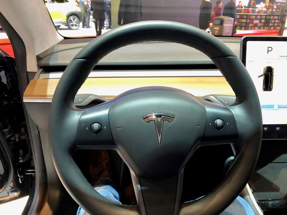
On its more expensive siblings a twist of the cruise control stalk adjusts this gap, but on the Model 3 you must tap to open vehicle settings, then tap again to open Autopilot settings, and again to make the gap ahead larger or smaller; one tap for each incremental increase or decrease. This seems like a distraction.
While there is a wiper stalk on the steering column, this doesn't offer the full suite of wiper controls as it can only be used to switch them on and off, and administer a squirt of washer fluid. When you switch the wipers on the touch screen's UI opens the rest of the wiper controls, and here is where you adjust their speed. We have no doubt that muscle memory will make these actions feel like second nature soon enough for most Model 3 drivers, but a part of us remains uneasy about the prospect of looking at a computer interface and tapping a screen to control the car's most basic systems. You can't even open the glovebox without using the touch screen.
This reliance on the touch screen is at the heart of why we feel the Model 3 is going to be an acquired tastes once Tesla gets production up to speed and more are on the roads. We feel we would be uncomfortable to adjust this setting — which is something you might want to adjust often on each highway journey — while driving with no passenger to do it for us. It is a similar story with adjusting the position of the wing mirrors, which is done by tapping into the correct menu and rotating the scroll wheels on the steering wheel.
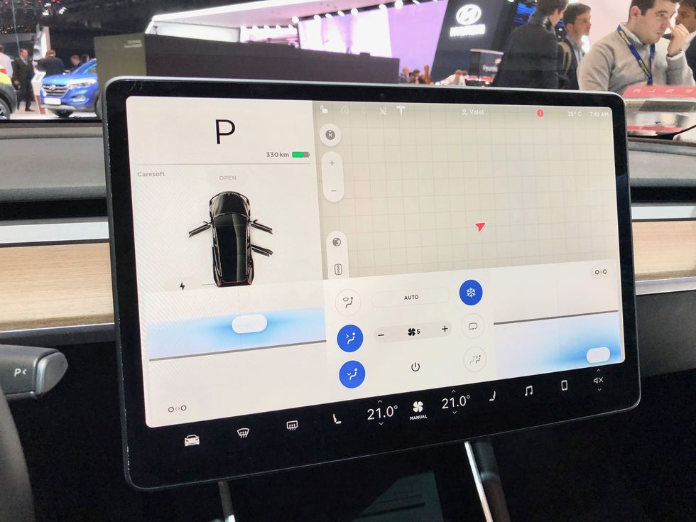
In better news (and a genuine surprise for us) is how the steering wheel position is changed. You've to head into the touch screen UI once more, but then use the scroll wheels to adjust the height and reach of the steering wheel. It's a neat feature but, again, is not the work of a moment like it is on other vehicles.
As with the S and X, the 3's touch screen is of excellent quality, and where Tesla is a league ahead of most of its rivals. The UI is slick, responsive, high resolution, attractive and (mostly) logical. The graphics look good and the system's responsiveness is something almost all of its rivals — century-old rivals, at that — should learn from. It really is like having a huge iPad on the dashboard, and the mapping app is particularly great.
Another control system unique to the Model 3 is how you adjust the climate, and specifically how you change the direction of air coming from vents in the dashboard. Where every other car on the market presents the driver with a near-identical means of moving and opening or closing vents, the Model 3 forces you to yet again jump into the operating system.
Here, you and the front passenger are presented with an interface where you drag an icon around to dictate the direction of airflow. Tap a button and you are given two icons for controlling two separate streams of air.
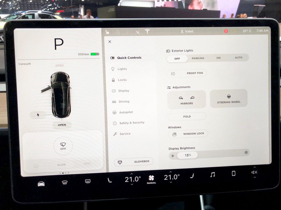
As a piece of UI it looks impressive and even revolutionary, but in practical terms we're concerned about how easy it is to adjust this while driving. And don't get us started on talking an unfamiliar passenger through what to do when they've spent a lifetime with the same, almost globally standardized system used by all other automakers. "Well that's just another thing to go wrong," a fellow Geneva attendee in the passenger seat said.
Stepping away from the touch screen, we are big fans of the wood trim stretching the length of the dashboard, and the (optional) panoramic sunroof is excellent, flooding the cabin and especially the rear seats with light. As for the rear seats themselves, they provide a good amount of space and don't feel any more cramped than those in the back of a Model S. Trunk space also seems good for a car of this size, which of course is aided by the compact nature of electric motors. The lack of an engine means the front trunk (Tesla calls it a frunk) is also a good size and larger than that of the Jaguar I-Pace.
Stowage space in the center console is also acceptable, although opening and closing it feels cheap. It also doesn't close in the way you might expect, as pushing it closed evenly slightly too firmly causes it to spring open again. As you instinctively close it with more force a message appears on the touch screen telling you to be more gentle. This feels more like a confession that the closing mechanism doesn't work properly, rather than a piece of useful advice.
It may sound like we are being more negative than most about our time with the Model 3 so far, but we felt these issues need to be raised. The Model 3 is a huge departure from the norm, and is even a departure from what Tesla Model S and Model X drivers would consider normal. It is clear that cost-saving in a bid to hit the aggressive $35,000 starting price has led to some of these UI decisions, and this has resulted in some smart work from Tesla's interior designers. The car still (just about) feels premium, but budget-imposed minimalism has actually served up a visually pleasing design - only one that, on first impression, distracts more than it should.
We can't wait to drive the Model 3 and spend some quality time with it before offering a full review. But, being based in the UK, it will likely be late-2018 or even early-2019 before this writer gets off the show floor and onto the open road. We just hope that our desire for the Model 3 remains as strong once electric alternatives from Jaguar, Audi, Honda and others arrive.
GearBrain Compatibility Find Engine
A pioneering recommendation platform where you can research,
discover, buy, and learn how to connect and optimize smart devices.
Join our community! Ask and answer questions about smart devices and save yours in My Gear.
