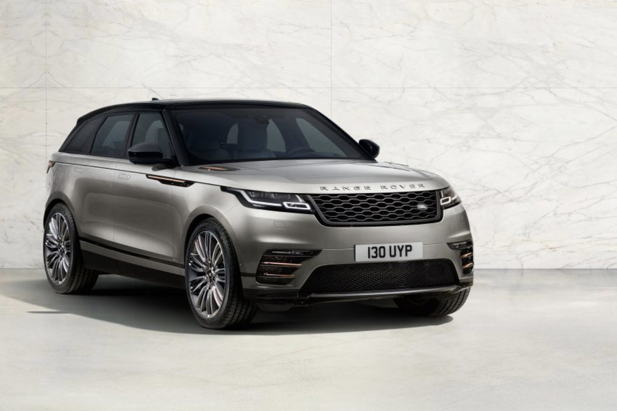
Jaguar Land Rover
Car tech review: Range Rover Velar strikes a balance between sense and style
Two touch screens are better than one — especially when they have rotating dials on top

Two touch screens are better than one — especially when they have rotating dials on top
The Range Rover Velar comes at a time when car manufacturers are feeling pressure to incorporating more technology than ever into the cabins of vehicles.
Drivers accustomed to high definition, powerful and incredibly responsive touch screens in their pockets now want the same technology in their cars — the slow, grainy displays of old simple won't cut it. But where smartphones and tablets are intended to take up all of your concentration, a car interior inherently cannot.
Read more car tech reviews from GearBrain:
This are the crossroads Land Rover is attempting to safely navigate across with the Velar's new three-screened interior. In every model of Velar the driver is greeted by an all-digital instrument cluster behind the steering wheel, a super-wide screen 10-inch touch screen at the top of the dashboard, and — in a first for any Land Rover — a second, lower and squarer 10-inch touch screen on what the company calls the 'flight deck'.

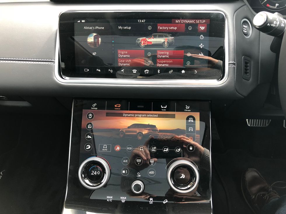
Being different and capturing your attention the moment you step aboard, the lower screen is where I'll start. This display is where you find the car's climate and seat temperature (and optional massage) controls, plus a settings page, heated windshield controls, and the Velar's various driving and off-roading modes.
I spent most of my time with this display showing the 'Vehicle' page, which shows driving modes, off-road options (snow, gravel, rock crawl etc) and ride heigh adjustments. All of these digital buttons are gathered around a pleasing photo of a Range Rover Velar. However, unlike in Teslas, this car is not representative of the one you are actually driving. I'd like to have seen this image match the color and wheels of the car itself.
Tapping on the 'Seats' button replaces all of this with large and clear controls for operating the seat heating, cooling and massage. This all looks neat enough, but accessing some controls takes more taps than feels entirely safe — at least for someone who is new to the car and lacks the muscle memory of a long-term owner.
For example, where seat massage systems are usually activated by a press of a physical button (usually on the door), in the Velar you have to tap Seats, then the massage icon, then the power icon. Changing the type of massage requires a tap of the seat, then a tap of the style you want.
Adjusting the seat heating or cooling can require as many steps. Some cars have a simple dial on the side of the seat base to activate and increase or decrease the heat. In the Velar it can be three or four taps of a screen which is next to your knee and a long way from your view of the road ahead.
Physical dials save the day
Thankfully, Land Rover has designed a solution to some of this screen prodding. There are two physical, rotating dials on the lower touch screen. By default, the left changes the cabin temperature and the right changes the vehicle driving mode (eco, comfort or sport). When on the climate page (which I soon learned is the page you should leave showing most of the time), the dials control temperature, fan intensity and — with a press — seat temperature. This means that, despite the massive touch screen, cabin climate can be controlled by feel and without looking.
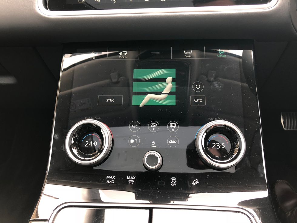
Because the dials sit on top of the display, their center also shows whatever is relevant at the time of you using them. Rotate to adjust the temperature, and that number will appear in the middle of the dial. Rotate to adjust the seat heating or cooling, and that number will appear instead. It's a neat approach which, once learned, simplifies the cabin. It reminds me of Steve Jobs introducing the iPhone's touchscreen as only showing what you need, when you need it.
I'd like some more feedback to the dials, as they feel too light and imprecise when I want to make fine adjustments to the temperature. I'd prefer to make larger, firmer and less precise inputs while driving, but I appreciate this is a small complaint.
Between the dials is a volume knob for the sound system, plus permanently displayed touch controls for disengaging the traction control and enabling Land Rover's hill decent system, which maintains walking pace while driving down steep off-road courses.
Off-roading (if you must)
Speaking of off-road driving, purists will no doubt balk at the idea of locking the differential, engaging the low-range gearbox and jacking up the suspension with the delicate taps of a touch screen, not by the yanking of leavers and reassuring clunks as bits of metal move into place.
But really, when is a Velar going to plough its way through a muddy field, let alone scramble over rocks, wade through water (to a depth of 450mm, if you must) and deal with 12 inches of snow? Very rarely, I'd imagine. But like knowing your watch can survive being submerged to 300 meters, it's reassuring to know what the Velar and SUVs of its caliber are capable of doing.
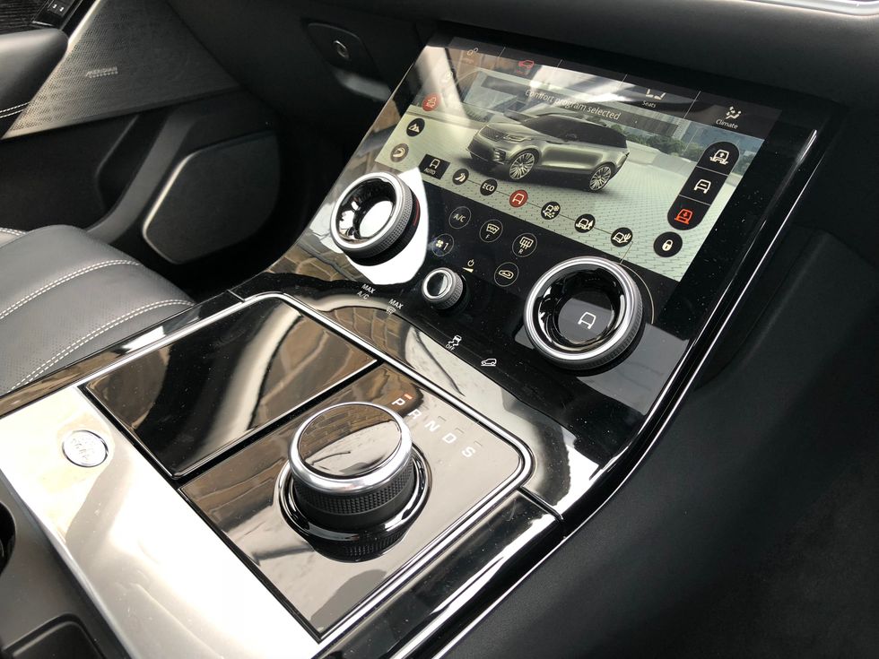
On a similar note, the Velar offers a 'dynamic' driving mode, which can only be accessed when the car is already in sport mode (with a turn of the rotary gear selector). Here, the upper screen can be made to show a G-force meter and even a lap timer. All rather unnecessary in an SUV, but a fun addition nonetheless.
Finished in gloss black, the lower display catches a lot of reflections, but the white button icons remain visible regardless of what the light is doing. The only issue I had was when driving under trees, where light coming in from the panoramic glass roof would reflect brightly off the 'flight deck' and become a little distracting. After a few hours with the Velar I'd got used to this and no longer found it annoying.
The upper display also features a 10-inch touch screen, but this is more in line with what Jaguar Land Rover drivers will have used before. The company's InControl Touch Pro system is attractive and works well, but doesn't quite offer the performance and ease-of-use buyers of such a luxury car might be hoping for in a vehicle like this.
No CarPlay
There is no Apple CarPlay or Android Auto, and without an internet connection (via a SIM card slotted into the car) some navigation data, like places of interest, is missing. There's a Spotify app, but this also uses the car's internet connection; you cannot connect an iPhone and control its Spotify app from the dashboard, which is a real shame. You can play from your phone's Spotify, and skip tracks with the car's controls, but your playlists, albums etc don't appear on the touchscreen. Thankfully, music stored on your phone (such as in the Music app of my iPhone) appears as normal.
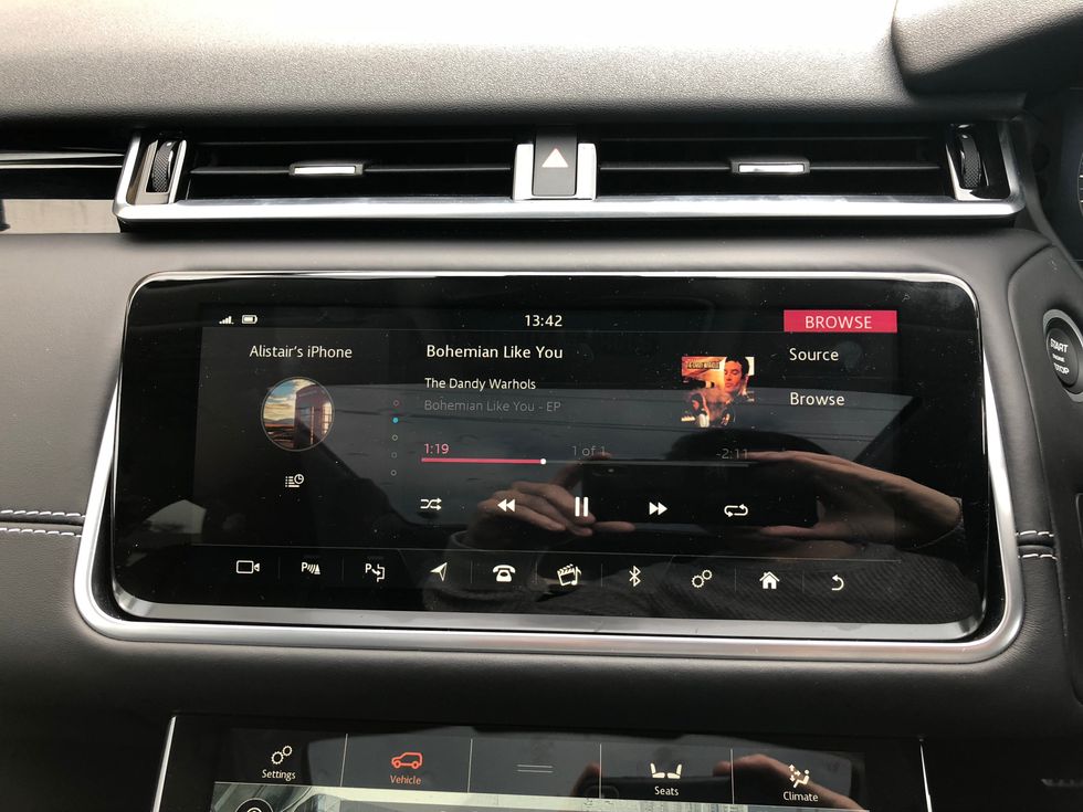
In a bid to combat reflections, the upper display's angle can be adjusted by 30 degrees. It tilts into position when you turn the car on (in unison with the gear selector knob rising from the center console), then falls flush again when you switch the car off. A silver lip running the entire length of the bottom of the display provides a useful shelf on which to rest your finger while prodding at the display's most important controls.
With a SIM card installed under the central armrest, the Velar's Wi-Fi network can be fired into life and provide up to eight devices with an internet connection. Also beneath that central armrest is a deep storage bin, plus two USB charging ports, a 12V socket, and an HDMI port for playing media through the optional (but not installed here) rear TV screens.
The navigation system works well (even without the internet connection), and the optional 825 watt, 16 speaker Meridian sound system is impressive. A 23-speaker system is available for audiophiles.
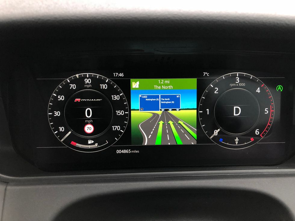
Finally, we have the instrument cluster display behind the steering wheel. By default this shows digital dials for speed and revs, but can be configured to show a large map, a single dial, or other layouts. The graphics are attractive, easy to read at a glance, and the menu system is simple enough to navigate while driving with buttons on the steering wheel. As well as media playback controls, the wheel has a button for speaking simple instructions to the car, like calling a contact and tuning to a radio station.
Autonomy
The Velar I borrowed had autonomous emergency braking fitted as standard, plus radar cruise control for automatically maintaining a safe distance to the vehicle ahead, and lane-keep assist, which alerts you and subtly steers the car back into the lane if you drift across the line without using the turn signal. The car can also read road signs to keep its speed limit readout updated, and the 'driver condition monitor' suggests you take a break if it detects you are acting drowsy. Parking assistance, which controls the steering during parking maneuvers, is an optional extra. Finally, blind spot assistance flashes a light in the wing mirrors when a vehicle is in your blind spot.
Conclusion
When the Velar was first revealed in May 2018, its dual touch screen system was a revelation. It took the wow-factor of a Tesla but added physical rotating dials and a degree of simplicity to make operating everything safer and less distracting. After finally using the system on the open road, I can say that Land Rover has mostly succeeded in blending touch screen flexibility with simple safety.
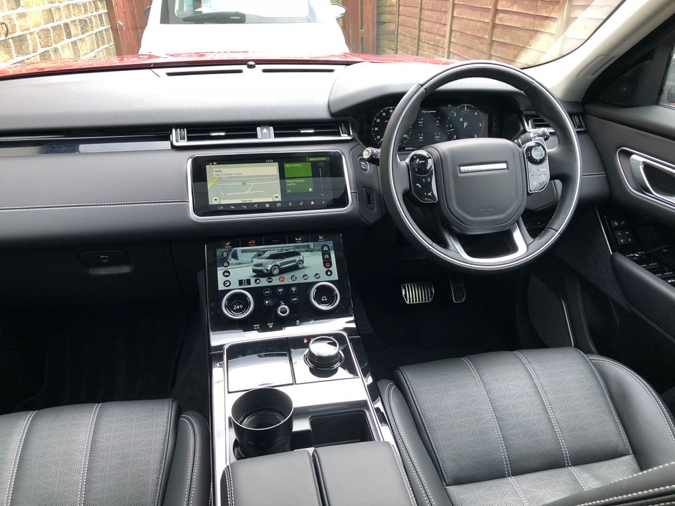
It takes a while to learn everything about the lower display — more than the four days I spent with the Velar — but I am sure owners would soon get used to it, and begin to use it with no more than a glance. The climate — likely to be used more often than anything else — can be operated without looking, the off-road controls are easy to use, and the whole system looks great. It creates a lot of reflections, but these don't prevent you from seeing each control.
This is the sort of compromise manufacturers need to be aiming for. While the huge touch screens on Teslas look cool and are appealing in the smartphone age, they can be difficult to use while on the move. Physical dials like the Velar's and an interface which looks more like an array of simple buttons than the operating system of an iPad — but which can be changed depending on the settings you require — is the right way to go.
Pros:
Cons:
GearBrain Compatibility Find Engine
A pioneering recommendation platform where you can research,
discover, buy, and learn how to connect and optimize smart devices.
Join our community! Ask and answer questions about smart devices and save yours in My Gear.
