Ford
Car infotainment review: Ford Mustang Mach-E with Sync 4
Ford's first mass-production EV arrives with an all-new Sync infotainment system

Ford's first mass-production EV arrives with an all-new Sync infotainment system
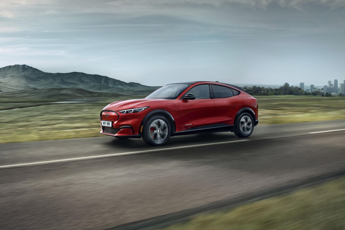
As well as being Ford's first mass-production electric car, the Mustang Mach-E is also the first to use the company's new Sync 4 infotainment system.
Having debuted at a Los Angeles launch event back in November 2019, the first Mach-E deliveries are now arriving with customers. The car is currently offered with two sizes of battery pack and with a single-motor, rear-wheel-drive or dual-motor, all-wheel-drive configuration. A sportier GT model will be along later in the year. Prices start at $45,000 for the smaller battery, single-motor configuration.
Read More:
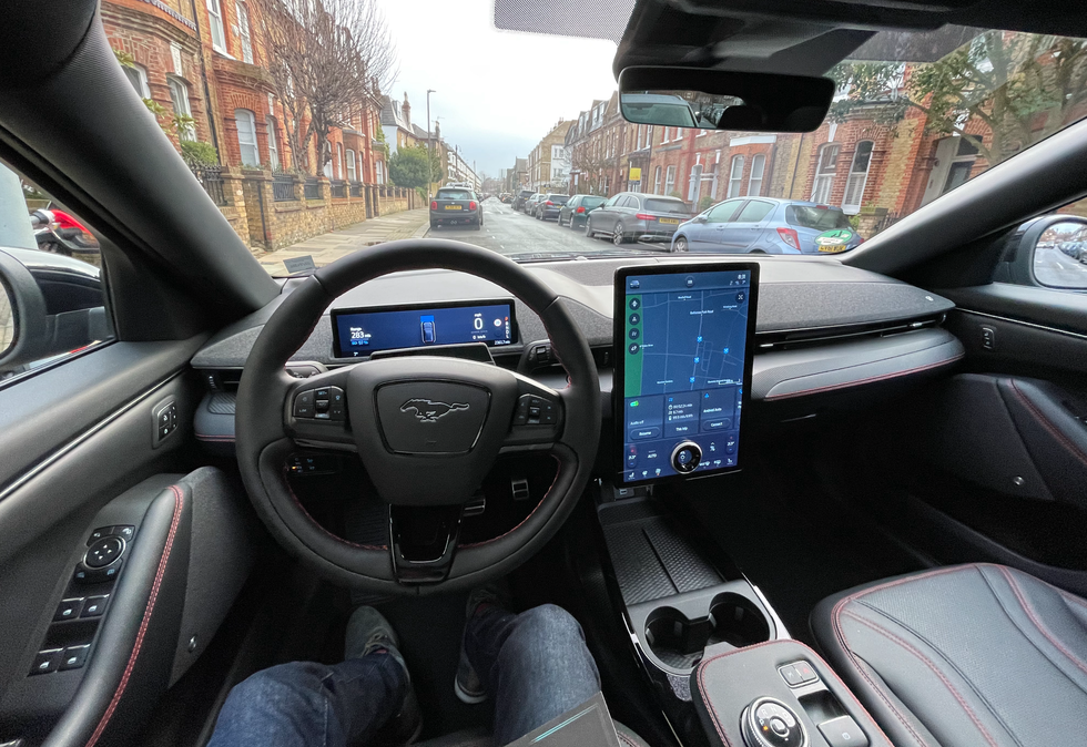
The cabin is dominated by a huge portrait-orientated touchscreen display. It measures 15.5 inches and is similar to that of the original Tesla Model S and Model X before they switched their screens to landscape for 2021.
The Mach-E has a second display behind the steering wheel. This shows speed, gear, battery charge and range information, and is the home to status icons for the car's various systems. It is bright, sharp and easy to read at a glance, while remaining unobscured by the steering wheel.
As for the touchscreen, there is a lot to take in. As with many of today's infotainment systems, climate controls reside permanently in the lower-quarter, making it easy to quickly adjust cabin temperature, fan speed, and activate the heated seats and steering wheel.
I found these controls easy enough to use, but felt they could be slightly larger. They aren't difficult to see, but sometimes I'd press at the controls (to adjust the heated seat, for example) and nothing would happen because I had missed the precise spot where the button accepts touch input. This might be something that Ford can fix with a future software update, and on that note the company promises regular (and fast) over-the-air updates for the Mach-E through its lifespan.
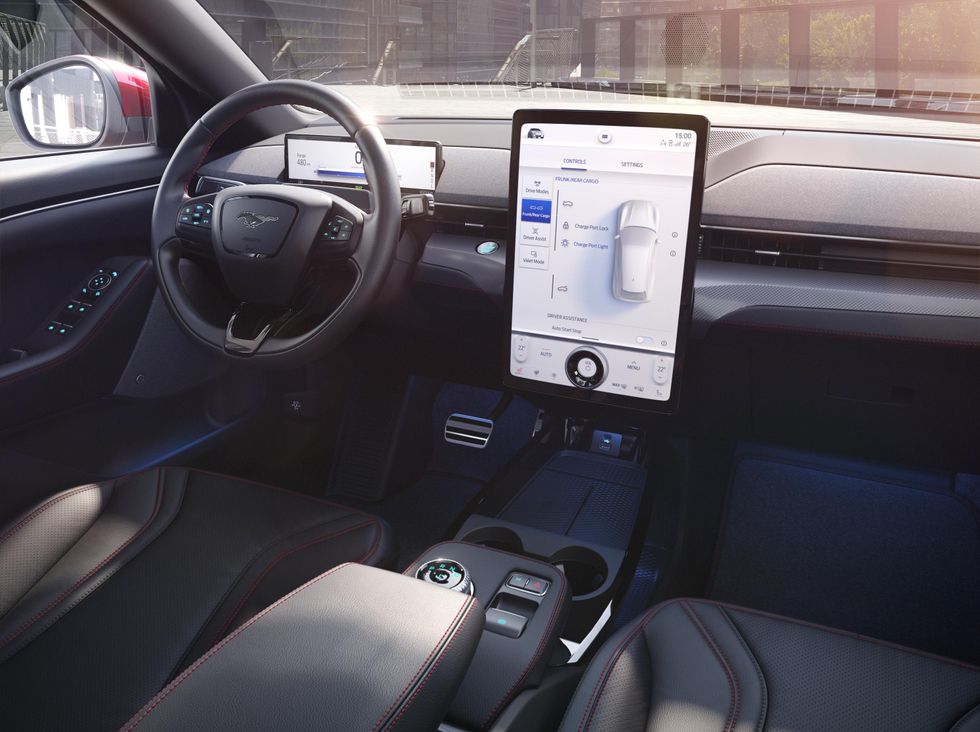
I'd also like to see a more obvious way of finding the vehicle's drive modes and settings. These are found in a menu opened by tapping the small car picture in the top-left corner. I wish this was more obvious, or better still, I wish Ford had added a drive mode button either to the steering wheel or next to the rotary gear selector in the center console.
At the center of the climate control panel sits a large rotating volume dial. When I first saw the Mach-E in 20219 I liked how For had incorporated a physical control with the large touchscreen. It reminded me of what Jaguar did when the electric I-Pace arrived in 2018, but I wish Ford had followed that example and integrated physical climate controls with the display instead of a volume dial. There are already physical volume controls on the steering wheel, making the dial superfluous. I also found myself hesitating to use the dial for fear of mistakenly touching something on the display.
As with previous Sync systems, Sync 4 is mostly legible and easy to read at a glance. Wireless Apple CarPlay and Android Auto are fitted as standard, and their interfaces take up the top half of the screen. The size of this display means the climate controls and a panel of shortcuts to commonly used functions, like the radio and phone, are always visible too.
Wireless CarPlay can drain your phone battery, but I love how seamless it is. Just get in the car, switch it on, and by the time you're ready to go your iPhone has already connected and CarPlay is running on the display.
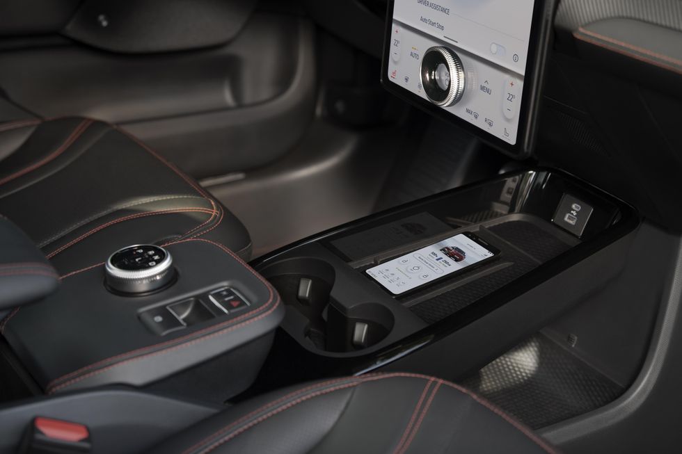
To counter battery drain without the clutter of a USB cable, the Mach-E is fitted with a wireless charging pad as standard (plus USB-A and USB-C ports). The pad has a rubberized texture and ridges to keep your phone in place, but unfortunately it didn't work reliably for me and would often stop charging. A message appeared repeatedly on the display to say as much, despite my iPhone not moving. CarPlay carries on as normal, being wireless, but seeing my iPhone constantly fail to charge soon became annoying, and even a concern on longer journeys when I'd left the USB cable at home. Hopefully this is a quirk of the press car I borrowed and will be fixed before the first customer cars arrive.
I also hope Ford can find a way to speed up Sync 4 in the Mustang Mach-E. Apple CarPlay worked flawlessly during my week with the Mach-E, but Ford's own software wasn't as slick. It never froze or crashed, but simple actions like swiping away an element of the user interface would result in an ugly stutter instead of a smooth slide.
I'm sure software is to blame here rather than hardware, and assume Ford isn't yet close to the ceiling for what the Mach-E's processor can handle. With all its talk of future over-the-air updates, one would hope there is still plenty of processing headroom, and those updates will initially help iron out the UI creases before adding new features and perhaps even improving efficiency and range too.
In better news, the Ford's 10-speaker sound system by Bang & Olufsen is very good. It has 560 watts of power and features a sound bar-like setup hidden behind smart speaker-style fabric on the dashboard. Behind the fabric, you will find a pair of 2.5cm tweeters and one 8cm midrange speaker, accompanying the usual array of speakers in the door panels.
Instead of using the same system as other Mustangs, B&O's engineers have adjusted its output to take into account the size and shape of the Mach-E's cabin, and also how an electric car's lack of engine and exhaust noise leads to a perceived increase in wind and tire noise. All you really need to know is, it's a very good system for this sector of the auto market.
The center console is home to a rotary gear selector for Park, Reverse, Neutral and Drive, plus a button marked L. This imitates a low-range gearbox by increasing the regenerative braking system, slowing the car more aggressively and feeding extra energy back into the battery – useful if coasting along a very long descent, but of little use during everyday driving.
Next to this is an electronic handbrake switch that is never really needed, given the handbrake is automatically applied when you come to a stop, and ahead of this is a button for activating the car's automated parking system. Press the button and the Mach-E starts looking for a space large enough to park itself into.
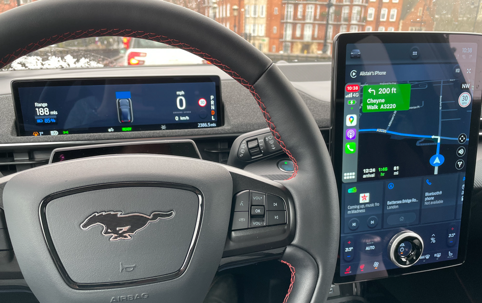
The interior is an interesting mix of modern technology and traditional switchgear. Much of the cabin will feel familiar to drivers of other Fords (especially the steering wheel and its stalks), while the driver display is all-new but simple and very easy to read. But, although the touchscreen is attractive, it isn't as slick as I'd hoped.
Lastly, the Mach-E makes use of the FordPass smartphone app for iOS and Android. This works like many other connected car apps, in that it can be used to see the car's location, as well as its battery level and estimated range, and to control the windows, locks, tailgate and interior temperature. The app also includes a database of public charging stations, and you can create personal profiles for each person permitted to drive your vehicle.
Pros:
Cons:
4-in-1 Alexa for Auto, Dual Port USB Charger, Bluetooth Car Adapter, FM Transmitter, WiFi Based Alexa in Your Car, No App Needed to Run Alexa
GearBrain Compatibility Find Engine
A pioneering recommendation platform where you can research,
discover, buy, and learn how to connect and optimize smart devices.
Join our community! Ask and answer questions about smart devices and save yours in My Gear.
